Communicating through telling stories is an innate part of what it means to be human. It’s what allows us to share beliefs and build connections in a way that the brains of other animal species simply aren’t wired to do. We’re used to telling stories through essays and creative writing, but when it comes to using data to tell these stories, people are often hesitant to adopt a stance and use data to argue it.
If I’m a BI developer, how do I have the skills (or even the permission) to tell a data story for another part of the business? How can I tell a story over data that frequently changes?
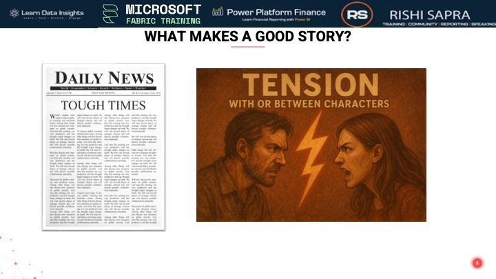
But these are just excuses we make for not building the best data visualizations we know we can! By understanding the specific user personas who the report is for, we can make them the central characters of our data stories and highlight the “tension” (resolved through the storyboard!) that every good story needs.
In this session, Rishi will:
Walk through the core structure of a gripping story, showing how this translates into Power BI using techniques like pre-attentive attributes, presenting data as arguments (rather than just statements), and providing a “so what” conclusion to the story.
Showcase examples of visualizations he’s built for the community and highlight the data stories he was communicating with them.
Attendees will walk away with an understanding of how to communicate with data in a way that their audience enjoys consuming reports and is able to take action based on the contextualized data arguments presented.
This session is aimed at anyone who wants to understand the impact of data visualizations and how they can be used to effectively communicate what the data is really telling you, framed within the context that the author (report creator) injects into the narrative.
The solutions shown/referenced in this session are included as portfolio solutions.